Creatorem UI is a comprehensive collection of modern, accessible React components designed to accelerate your development workflow. Built with TypeScript, Tailwind CSS, and the latest web standards, our component library offers beautifully crafted elements that seamlessly integrate into any Next.js or React application.
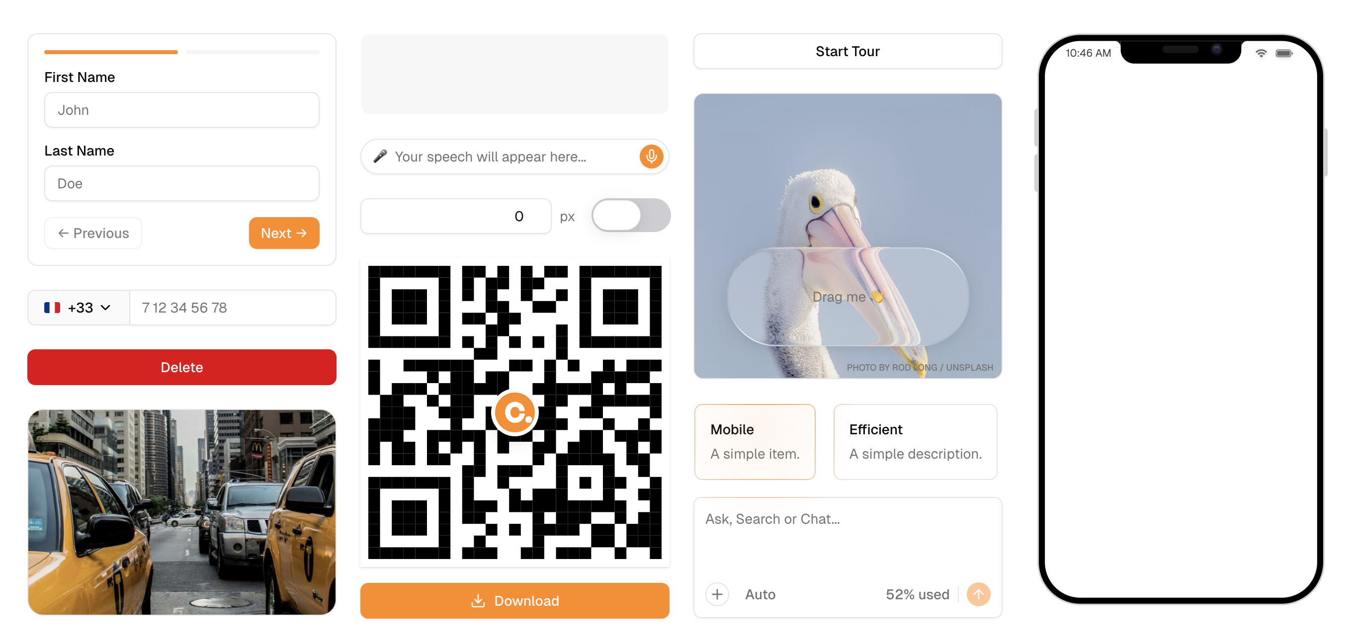
Our collection includes advanced interactive components like guided tours, liquid animations, media managers, file uploaders, and sophisticated motion elements with glow effects. Each component is meticulously designed with accessibility in mind, featuring proper ARIA attributes, keyboard navigation, and responsive design patterns. From simple utility hooks like copy-to-clipboard and input drag controls to complex UI patterns like steppers, confirmations, and QR code generators, Creatorem UI provides everything you need to build exceptional user experiences.
Whether you're building a modern SaaS application, an e-commerce platform, or any web application requiring polished user interfaces, our components save you countless development hours while ensuring consistent, professional design across your entire project.
🌐 Live Components: Check out our interactive component showcase at creatorem.com/ui
📖 Documentation: Comprehensive guides and API references at creatorem.com/docs/ui
- Interactive Elements: Tour guide, Stepper, Confirm Button
- Media & Files: Image Dropzone, File Upload, Media Manager, QR Code
- Motion & Effects: Glow SVG, Liquid animations (Glass, Slider, Switch)
- Form Controls: Number Input, Progression indicators
- Layout & Display: Ratio Preserver, Skeleton loaders
- Utility Hooks: Copy to clipboard, Input drag control, Delay management
Licensed under the MIT License. See LICENSE for details.